Saturday, April 28, 2012

Is $AAPL overvalued Part 2, or what does Mr Market know?

Almost exactly three weeks ago (April 5, 2012)  I did a comparative study on Apple versus other large technology companies. The answer was "no", and one of the key pieces of evidence was the following table:


Since then, all of the companies in the list have reported their earnings, and we have the situation as below:


What do we see? Apple had smashed expectations, and at this point its trailing and forward P/E is better than that of all of the other names, except Microsoft, which leads rather narrowly, and which has considerably dimmer growth prospects than Apple. Google has done a good deal better than expected (looking at the old and new P/E figures). Both of their stocks have gone down considerably over the last three weeks. Curiously, the best performer of the bunch (by far) is Amazon, which has a crazy earnings multiple, and worse growth prospects than Apple. What does it all mean? I don't know, but Apple looks even more attractive now.

Monday, April 16, 2012

An Unscientific observation on Apple

I was loitering (sorry, working) in the Princeton Market Fair Starbucks (not a university hangout,mostly local professional people from the nearby office buildings). When I walked in, five people were working on laptops -- all of them MacBooks. When I left, two people (different from the first five) were working on laptops -- both MacBooks. Yours truly had to be different with a Zenbook (I needed to run Bloomberg), but also an iPad to compensate.

Saturday, April 14, 2012

I Love you do death II: Or, hugging the benchmark

In the last post I cast aspersions on Google leadership by comparing Google's performance with that of Apple. This could be viewed as not entirely fair, since Apple sets an extremely high standard, and maybe Google's management, while not in Apple's league, is still very strong? With this goal in mind, let us compare Google's performance with that of S&P 500 (with dividends reinvested) -- we use the SPY ETF as proxy (this will have the effect of making S&P 500 returns look very slightly worse than they really are). Let us see what would happen if our GOOG-r-us hedge fund constructed a dollar neutral portfolio, which was long GOOG and short SPY. Here is what our results would look like:


You see that our fund would have done very well in the first three years of its existence, but it would have floundered aimlessly for the last five years: since mid-2007 Google has been tracking the S&P 500, so its performance has been (in a technical sense) mediocre. To avoid cluttering this post, I will not include a beta-hedged chart, but the results look exactly the same (Google's beta vs the S&P 500 is 0.8, which is good, but hardly a spectacular accomplishment for "the company of the future.")
  • On the one hand, this bears out the contention in the last post that the skill set require to start a company is quite different from that required to keep it going, and it seems that Brin-Page-Schmidt have the former but not the latter.
  • On the other hand, an even more cynical observer would remark that Google historical performance is exactly what you would see for a fund perpetrating the scan described in a recent post:: very impressive performance from inception, but hugging the benchmark for the last several years.


Either way, not a great argument for giving Google founders any more rope, er, voting power.


Friday, April 13, 2012

I love you to death, or: Monarchy vs Meritocracy

Yesterday, as part of their quarterly report, Google announced that it was going to do a weird stock split, whose main purpose appeared to be to consolidate power in the hands of the founders (Brin, Page, and Schmidt), who currently control 2/3 of the votes of Google. In a letter, the founders explained that they so loved the company that they felt they needed to keep shepherding it, without interference from pesky shareholders. This brings up the obvious question of how well they had been shepherding it, and since everything in this world is relative, who better to compare Google to than its tech rival Apple (whose shares tanked today out of solidarity with Google, demonstrating again the great efficiency of the stock market). It should be noted that through almost all of the period we will be looking at (Google's lifespan as a public company) Apple has been led by Steve Jobs, who had famously sold all of his founder's shares but one when he was fired from Apple, and while he had acquired a fair bit of stock during his second coming, he certainly did not have a measurable amount of voting stock. Same goes for his successor Tim Cook, who, when his options vest will have a princely 0.05% vote. So, how did the two companies do?

First, the obvious price chart:
You will see that GOOG started trading at $100 a share on its IPO day (8/19/2004). Its price doubled to $200 a share in two months, and it is now trading at a bit over $600 a share, considerably below its late 2007 all-time high. By contrast, AAPL was trading at $15 a share (adjusted price, there has been a split in the intervening period) on Google's IPO day, and it is now trading (by a curious coincidence) roughly for the same price as Google. For a total outperformance of 6.5x in the seven and a half years. 

This, however, is only the beginning of the story. First, let us look at Apple's annualized alpha vs Google:

(alpha charted is the simple six month regression alpha).
You will see that Apple has consistently outperformed Google. But wait, there is more. Let's look at the beta of Apple's returns vs Google (after all, if we believe in the Capital assets pricing model, Apple performance should be easily explain by the higher volatility of its returns:

(beta is the six month empirical regression beta, no GARCHes harmed...)
Surprise: AAPL beta vs GOOG (except for literally a few days in 2007) has been much below 1. In other words, Apple's performance flies in the face of CAPM, since its risk-adjusted returns are truly phenomenal.

Those of us in money management business measure risk-adjusted returns by Sharpe Ratio (which is the ratio of mean return to the standard deviation of returns). Google's annualized Sharpe Ratio is a rather unremarkable (if solid) 0.69. Apple's is 1.27 -- essentially double Google's, and very good (given the long period marked by a major recession) for any hedge fund, and without the benefit of the diversification that a hedge fund would have.

So, Steve Jobs managed to run Apple very successfully while not having the ability to pick the board, and did it while enjoying complete control of the company, which the board was more than happy to give him. Jobs had famously said that he did not give a shit about the stock, and yet his bean-counting statistics are far superior. Not only was he allowed to run the company as he saw fit, but Cook is his hand-picked successor. Meritocracy works. But there is more: in 2004, Apple was very much an also-ran computer maker, who had just introducers the iPod. Google already had the monopoly share of internet search at the time of its IPO. In the intervening years, Search (or more precisely, selling advertising on search) remains Google's only serious money-making business. All of Google's other efforts have been attempts to disrupt other people's business at great cost to itself (examples: Google+ is an inferior version of Facebook, Android is an inferior copy of the iPhone, which has not hurt Apple, but destroyed Microsoft's phone business, and contributed to the destruction of RIM, Google apps is a poor attempt to compete with Office, Google Finance is a poor cousin to Yahoo! Finance, Google Play is an attempt to undermine iTunes and Amazon...) The one exception to this is YouTube,which is actually the leader in the field, but I don't know that it actually pays for itself (the amount of advertising is minimal, and the costs, given that video is very storage intensive, must be very high)

Bottom line: Brin, Page, and Schmidt started a great company, but starting and running a great company are, it seems two very different things (Jobs did both, but his second coming was twenty years after the founding of Apple -- he had apparently learned a couple of things in the meantime). So giving the founders control in perpetuity is a stupid idea, and I would not invest in any IPO which does it (that means you, Facebook).


Sunday, April 8, 2012

More trading strategies, or "there is one born every minute"

In this post I discussed a model for how some hedge funds make money.A couple of weeks ago I was chatting about this with an acquaintance who runs a mid-size university endowment, and he said: NO! That's not how it is done! I was prepared to hear that hedge fund managers are caring nurturers, and would never do such a thing, but instead he continued: What you do is this: Let's say you have $25 million in start-up capital. You divide it into five piles of $5 and start up five funds with variations of your strategy (which might consist of throwing darts at the bloomberg terminal). At the end of a year or two, by sheer luck, one of the funds will have done really well, some will have done ok, and some will have tanked horribly. At this point, you shut down the underperforming funds, and publish the results of the overachieving fund (in, for example, the standard databases). The stellar performance will attract suckers investors, and then you continue running that one fund, but now you hug the benchmark closely. What happens then is that your recent results don't look so stellar, but your results from inception look great. It seems almost too easy (and does not work with sophisticated investors like my friend, but, sadly these are in the minority).

Thursday, April 5, 2012

Is $AAPL overvalued?

There has been much hysteria lately about Apple, and its skyrocketing stock price. Many comparisons have been made to 1999 and the tech bubble. While some current tech IPOs do remind one of the good/bad old days, Apple seems a poster boy for sanity. Indeed, consider the following comparison:

You will see that Apple's valuation is quite reasonable (even more reasonable if you take into account the traditionally conservative forward looking statements), and if you believe that it can maintain its current growth rate, it is actually cheap compared to its tech rivals. Can it? Hard to say, of course, but they appear to have a successful plan, which includes:


  • iPhone 5 (coming out either Summer or Fall of this year).
  • new generation of (most likely) retina display MacBooks
  • a disciplined software strategy which includes the convergence of iOS and OS X
  • Apple TV

While all of this is happening, Apple is struggling to meet demand for its existing products. Observations during a recent trip indicate everyone in first class sporting iPhones. It seems clear that everyone in economy wants one (many people have them already), and the iPhone 3GS, from all reports, is a very hot seller (and a money machine for apple, since it costs very little to make). They are about to start making the iPad 2 in Brazil, which will open up the rapidly developing (and tariff protected) Brazilian market to yet another apple money machine (iPad 2, being last year's technology, is extremely profitable).  Apple is also making a lot of money from the very popular Android handsets. So far so good.

Things do not quite look so rosy for the competition. AMZN is operating a fairly mature bookstore business, and its Kindle hardware business is about to be killed by the new iPad, which gives a vastly improved reading experience.

Google's search business is alive and well, but, near as anyone can tell, its many other efforts have produced a string of duds, at least from the business perspective. Android, while popular, generates far more revenue for Apple, Microsoft, and Qualcomm than it does for Google. Google+ has been forced down the throats of the public, which still prefers Facebook by a huge margin. Chrome and YouTube are popular in their spaces, but neither is a big revenue generator. Google seems to lack a coherent strategy -- thank God for search.

Microsoft has an Office money machine, which will continue to crank for quite a while, Windows, and a considerably less lucrative Xbox franchise. Windows and Xbox are being seriously threatened by tablets, and while Windows 8 is an attempt to combat this, it seems to combine the not-quite-ready-for-primetime aspect of Android with the closed programming model, heavily encumbered by compatibility concerns. Not a recipe for wider adoption than the current Office-user user base (I have a Windows laptop just so I can run bloomberg terminal and excel together). Windows phone has been (so far) a failure. No risk of MSFT being the next RIM, but no particularly bright prospects either.

IBM is well-managed and profitable, but not exactly nimble. It is a mature company which seems to have few prospects for (or even interest in) rapid growth. Its R&D is stellar, and it will continue to make money  for the foreseeable future, so I don't think any fund managers will be fired for buying IBM, but it is not clearly a better investment than Apple.

To summarize: I would not be at all surprised to see AAPL hit $800 after the next quarterly report (in less than three weeks),  especially as I think that the new iPad is an unqualified success, and for those not willing to take a naked technology bet, going long AAPL and short GOOG and AMZN would seem to be a wise strategy (as it has been for quite a while).

Monday, March 26, 2012

Update on Market Efficiency

Our last post on the curious behavior of the AAPL stock price was a little over three weeks ago, and since it is now (approximately) two months since Apple's last quarterly report, and since some "forward looking statements" were made in the last report, AND since in the intervening period Apple has


  • Announced the new iPad
  • Sold a bunch of them
  • Announced a dividend (for the first time since 1995) and a stock buyback.
Curiously, the stock price (at this point the run-up has been sufficient to mandate using a log plot) has been increasing almost mechanically log-linearly:


For those who care about such things, the (annualized) Sharpe ratio of an investment in Apple over this period is very close to 9(!)

What to make of this? Apparently the process of gigantic mutual funds loading up on AAPL is continuing, and its speed depends in part on the decision-making speed of the appropriate committee, and partly by the reluctance of said committees to move the market to much, so that the buy orders to their brokers are spread over weeks (of course, we all know that the market is efficient, trends do not exist, and you can only hurt yourself by acting quickly. Why, you might pull something...)

Saturday, March 3, 2012

A brief update on gold

There have been considerable conniptions, consternation, wailing, and gnashing of teeth over the price of gold in recent times. Here is a quick look at reality. Below is the graph of the natural logarithm of the price of gold (measured by its proxy GLD) from its inceptions in 2004 to present day:

You will note that the graph hugs its trend line very closely, and has not really deviated much from its appointed rounds. You do see a wiggle at the very end, but a quick check will reveal that over the entire history, GLD has been gaining 7.2 basis points a day on average, with standard deviation of 13.5 basis points a day (so Sharpe ratio of 0.85), while over the last twelve months, the average return has been 6.8 basis points a day, with standard deviation of 13.4 basis points, for Sharpe ratio of 0.81, so yes, the risk adjusted returns have dropped, but not hugely. Notice also that the graph (at least in the date range shown) shows no indications of a bubble (you can see a mini-bubble in early 2008, followed by the mini-crash in late 2008 -- presumably the mini-bubble was caused by the contemporaneous, and much more substantial,  oil price spike, while the crash was caused by the general panic of the crash of 2008, but not again that the crash was much more mild than the crash in the oil prices (factor of six, peak to trough), and the stock market (close to a factor of two).

Efficient markets?

On January 24 2012, Apple came out with its quarterly data, which completely obliterated analysts projections. AAPL was trading at a P/E multiple of around 12 at the time (already quite low for a company with Apple's growth). Following the earnings report, we saw the following price movement (presumably not over, unless Apple really screws up the iPad 3 badly):

In other words, after a relatively modest 4% jump on the day following the earnings announcement, the stock has been going up linearly. No significant news has come out since the earnings report (there have been reports of the coming iPad 3 for several months, and since, in the post-Steve Jobs era, Apple secrecy is not what it used to be, the rumors have been detailed and consistent. Much has been said of the considerable Apple cash hoard, but that, again, is not news. The question is: since all the relevant information has been available for over a month, why such a slow reaction time, which flies in the face of the efficient markets hypothesis. The only explanation I can come up with is that Apple is large enough that to significantly move the price, very large pension funds and mutual funds have to decide to buy, and whatever these guys are, quick on the uptake is not it. The morals of the story seem to be: not all opportunity lies in $10 cap micro stocks, and those of us with money in (for example) TIAA-CREF should be very sad.

Friday, September 9, 2011

A non-arbed-out trading idea

It is an empirical (but not fully backtested) observation that every time our  fearless leader speaks the market tanks. Some have doubted this on the grounds that correlation does not mean causality, but the first (and quite considerable) example of this phenomenon happened on the occasion of his inauguration, where, as the great man spoke the S&P 500 plunged by around 5% (from 840 to 805), this setting the tone for the rest of his term (I almost said "hopefully his only term", but the alternatives look pretty bleak also).

Marc Faber: Gold is Dirt cheap.

Faber is not a stupid guy.

Your friend igor@rivinfinancial.com has shared a link with you.

Marc Faber: Gold is "Dirt Cheap" — Price Could Reach $10,000 per Ounce | Daily Ticker - Yahoo! Finance
http://finance.yahoo.com/blogs/daily-ticker/marc-faber-gold-dirt-cheap-price-could-reach-130058708.html
Eleven years into a gold bull market, Marc Faber publisher of the Gloom Boom and Doom report still doesn't think gold is in a bubble. Joining us via Skype from in Chiang Mai, Thailand Thursday, Faber told the Daily Ticker's Aaron Task there are fundamental reasons why gold, already nearly 30% higher for they year, [...]
Read the full story

Wednesday, August 17, 2011

Very well put

I
David Stockman: Rick Perry Is Right, the Fed Is â€Å“Totally Wrong” | Daily Ticker - Yahoo! Finance
http://finance.yahoo.com/blogs/daily-ticker/david-stockman-rick-perry-fed-totally-wrong-151724790.html
============================================================
Yahoo! Finance http://finance.yahoo.com/

Wednesday, June 8, 2011

The continuing mystery of gold

Actually, as previous posts seem to indicate, there is no great mystery to gold: the executive summary is that it is not so much that gold is going up as that the dollar is going down. What is, however, mysterious, is that the gold miners are not doing very well. Indeed, this year, gold prices (as measured by GLD) have gone up some 8%, which is (as of today, June 8 2011) considerably better than any of the stock indices. Gold miners, however, are performing truly abysmally: the chart below shows the performance of gold vs S&P 500, vs NEM --  Newmont Mining (NEM), which is down almost twenty percent year to date. A picture is worth a thousand words:


 Newmont's friends and competitors which constitute the GDX ETF are doing abut the same. Now, if gold prices were very high compared to the cost of extraction, then gold miners should be doing very well. If, s previously suggested, we have no gold bubble, then the cost of extracting gold out of the ground should be growing roughly as the price of the metal itself, and if the margins were roughly constant in percentage terms, the prices of mining stocks should be growing roughly as fast  as the price of gold. It has been suggested that the wear and tear on the mines is adversely affecting the price of gold miners. Let's test this theory, and look at the Price/Earnings ratio of long-suffering NEM versus that of the S&P.


The sharp-eyed reader will see that until the end of 2009, gold miners were the toast of the town, but since the beginning of 2010, they suddenly became the black sheep of the investment community, and the current P/E of Newmont (around 11) is only slightly higher than that of the S&P 500 at the nadir of the stock market collapse (3/9/2009, when it was a little over 10). Indeed, while NEM's share price (adjusted for dividends) has risen by 25% over the last five years, its P/E ratio has gone from around 70(!) to the current 11.

The only at all plausible explanation  for this strangeness I have seen is that some hedge funds use gold mining stocks to hedge their gold positions. Well, actually, this does not really make sense to me -- the obvious trade at this point is go long miners (perhaps hedging with GLD), but nothing else does either, since it seems that GDX and friends appear undervalued by some 30% (and there have been massive selling in the last couple of days).

NOTE: Samsara is long gold mining stocks, and has been for quite a while (somewhat to its chagrin).

Saturday, June 4, 2011

Trading strategies

I had fallen victim of Amazon's one-click Kindle purchasing one time too many, and, without thinking, bought this book, which, to my dismay, is another piece of chartist claptrap backing up its techniques with claims of years of impressive results -- I discovered this on a plane flight, and quickly diverted myself with a nap, but this experience turned my thoughts to that best of gambling (which is really the same as trading) systems: the martingale. To refresh the reader's memory, this system (already popular in 18th century France) allows one to win against any casino game, no matter how big the house edge. As an example, we will use Roulette, in its primitive red-black form: the gambler comes into the casino, and bets a dollar on red. If he wins, he walks away. If he loses, he bets two dollars. If he now wins, he has won two dollars after losing one, so walks away with a dollar net gain. If he loses, he now bets four dollars. It is easy to see that this sequence of double-downs allows our gambler to walk away with a dollar, with probability one. Somewhat unfortunately, this system works particularly well if you have unlimited bankroll, in which case winning a dollar might be viewed as rather small pickings.

The first (and most important) improvement to this strategy is to start a hedge fund. Let's assume, for the sake of argument, that the starting capital is $1000. Our intrepid money manager (based in Atlantic City, for convenience -- lets call him A) walks into Taj Mahal every trading day, and practices the martingale. Since his Sharpe ratio is infinite (every day he makes his dollar, like clockwork), his investors are happy. In the 250 trading days of the year, he makes \$250, which is a 25\% return, of which he collects a 20\% performance allocation of \$50. In addition, he makes \$20 in management fees, so in a little under four years our hero is around \$250 richer. A good thing, too, since this is roughly when A loses \$1000, to the chagrin of his investors.

The next, and also important step, in this process is leverage: Money manager B, having observed A, is horrified that the investors had lost money, while A has made out rather well. So, B borrows money on margin, so he now has \$2000 to play with, so he scales up his bets two times higher than A. At the end of four years, not only does he have \$500, but when the day of reckoning comes, a large chunk of the damage he suffers is allocated to the lender, so both B and B's investors are happy. Not so the bank's shareholders.

As a final(?) improvement, our manager C has not \$2000, but \$20000000000. All of the activity in the previous paragraph takes place, but now the bank's shareholders (and especially its bondholders) proclaim the bank too big to fail, and the bill goes to the taxpayers, of whom there are quite a few, and it takes only a few dollars of the savings of each of them to subsidize C, his investors, the bankers, and the vitally important luxury yacht industry, it seems that everyone is now happy.

Progress is a wonderful thing!

What is interesting is that the parable described above not only describes much of recent "investment" activity, but also encapsulates pretty much the entire content of The Black Swan, at greatly reduced investment of time, money, and pseudo-intellectual rambling.

Thursday, June 2, 2011

More on inflation

This is a continuation of the last post. After looking at it, it seemed to me that the interpretation of the chart was a little oversimplified, and that was because the numbers had changed so much over the 18 years of the study that log scale would be more enlightening. No easier said than done (OK, a little easier said). Here is the same graph in log scale:

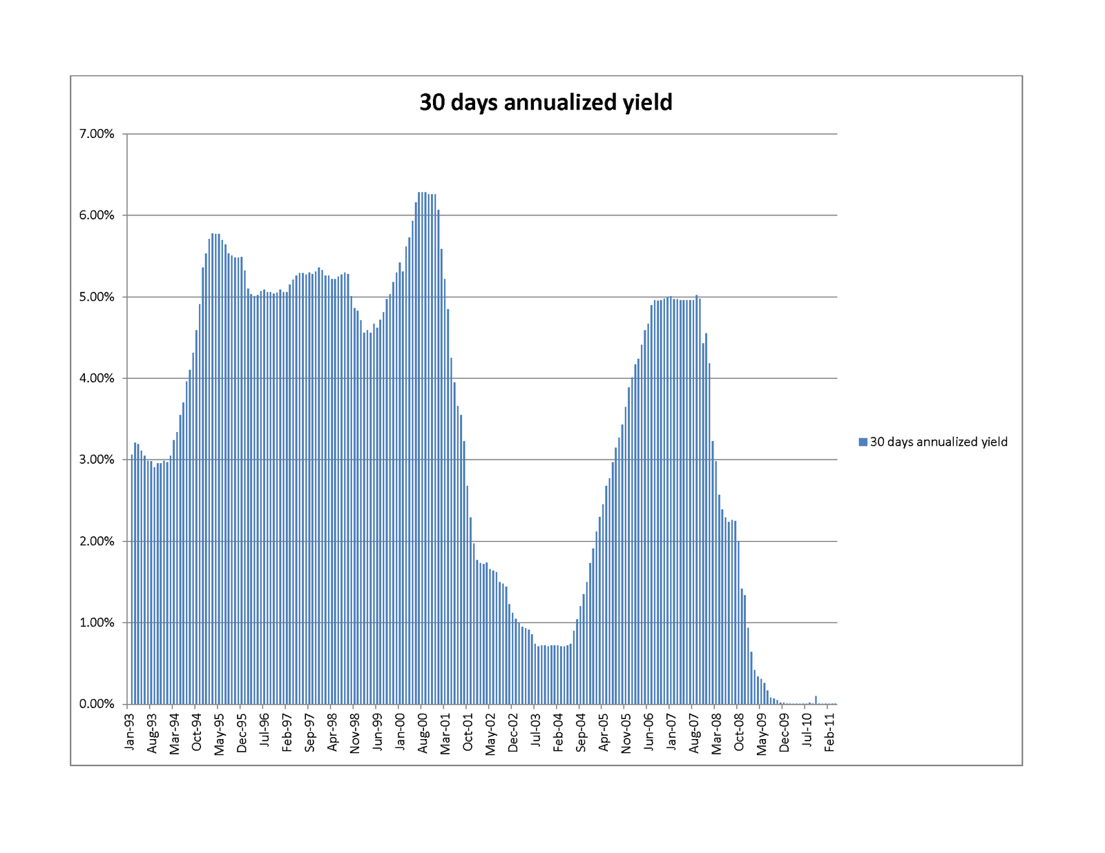
In this form, it seems clear that (other than some cyclical behavior) there was essentially no commodity price inflation from the beginning of the study (January 1993) until the end of 2001 --  beginning of 2002 (also known as the Dot Com crash). In those nine years, a conservative saver seems to have actually increased the purchasing power of his bank account quite considerably (by around 50%, in real terms). During that golden age (which we can call the Age of Clinton), there was a combination of the peace dividend, considerable technological innovation, a gridlocked government which actually managed to run a surplus, and fairly conservative fiscal policy. The chart below shows prevailing money market rates, which are closely tied to Fed Funds:

You will note that the "Greenspan put" coincides almost exactly with the end of the golden age (marked somewhat more memorably by the terrorist attacks of 9/11/2001). The massive money printing, did not wait to make itself be felt: tgold prices rise at a 1.5% a month clip -- the log scale graphs are amazingly linear (the F statistic, which shows the strength of the trend, is around 5000), commodity basket prices rise somewhat slower (1.1% a month clip), with more variability. During this period (the last ten years, approximately), our hapless saver's money market account gains around 20% in nominal dollars, but loses around 70% of its commodities purchasing power. Being no fool, our saver decided to invest her hard-earned dollars in real estate, but imagine her dismay when that investment did about as well (or poorly) as her neighbor's money market account (the graph below shows the change in the Case-Shiller index versus the Money Market account. You will see that nominally, Case-Shiller outperformed the money market account by around 15%, but all of that and more was eaten up by transaction costs, property taxes, and so on. I am only viewing housing as an investment, so am not counting the savings of rent or the mortgage tax deduction.


Since the move into housing was borne of desperation with the performance of the simpler ways of saving, it is not at all surprising that the returns are similar, though as we all know, the disruption caused by the fact that real estate investment is very far from risk free (as everyone now knows) has been rather considerable.

It is always harder to determine causality than correlation, so the graphs by no means prove that that monetary policy caused the end of the Golden Age of Clinton and the implosion of our savings, but they do provide some food for thought, I hope.

Wednesday, June 1, 2011

What is inflation really, or what's the use of gold?

Those who have read this previous post probably (and understandably) wonder how reasonable the Alternative CPI measure is. After all, it seems to indicate that our cost of living has increased almost four-fold since 1993, which seems rather steep (mostly since for only very few of us has our income increased four-fold in the same period). There is no question that the official numbers are seriously gamed (see this note, or this), but that, in and of itself mean that the alternative numbers are right. My personal view is that the Alternative CPI measure is more a measure of inflation (that is, the debasement of the dollar) than the actual CPI growth -- the latter tends to be smaller than the former, since the money-printing is offset by technological progress, which causes computers to drop from $6000 in 1981 to $150 at Walmart in 2011 (the latter computer also being several orders more powerful), and your car's fuel consumption to go from 8mpg in the 1960s to 40mpg today.

A good proxy for inflation is, however, provided by prices of commodities (still not perfect, since exploration and mining also have made considerable strides), and since a representative basket of commodities is rather cumbersome to hold, a good proxy for one is gold -- indeed, gold is almost miraculously convenient -- it is compact, it does not degrade, and it saves you from buying shares of oil tankers parked off Singapore.

The above seems counterintuitive (after all, we have all heard of the gold bubble, but [relatively]  few of us have heard of the the wool, rice, natural gas, or any one of the many other possible commodities bubbles. Well, luckily for us, the IMF maintains a commodities price index, so we can compare and contrast. Here is the requisite chart:

Some explanation might be in orer: The very smooth red line shows how many dollars you would have were you to invest $1 in a money market account in January of 1993. The almost-as-smooth green line shows how many of those dollars you would need according to the Alternative CPI computation to purchase a basket of goods worth $1 in Jan 1993. The jagged purple line shows how many of those dollars you would need to purchase however much gold you could buy for a dollar in January of 1993, while the really jagged light blue line shows the same for a dollars worth of a commodity basket. The conclusions, at least to me, are:
  • The Alternative CPI seems, as advertised, to be a good measure of inflation (and is, therefore, a bit of an overestimate of the actual price inflation).
  • There is no gold bubble (a conclusion also drawn in a previous post from other data).
  • Gold (in addition to its compactness) is a better gauge of monetary inflation than the commodities basket (witness the huge volatility in the latter starting in late 2007  or, for that matter, just in this May.
  • The red line (your risk free return) was added just to make the chart more depressing. Unfortunately, it has achieved its goal brilliantly.

Wednesday, May 25, 2011

Your dollars at work, continued

To add some color to the previous post, we can compare how the returns of our instruments of choice, to wit:

  • FXA (corresponding to Australian Dollar money market fund).
  • FXE (corresponding to a Euro money market fund)
  • FXF (corresponding to a Swiss Franc money market fund)
  • GLD (corresponding to physical gold)
  • SPY (corresponding to the S&P 500 with dividends reinvested)
  • IWM (corresponding to the Russell 2000 with dividends reinvested)
Perform in terms of constant (constant purchasing power, that is) dollars. This is not as easy as it seems, since the Bureau of Labor Statistics CPI index, which would be the natural measure of inflation, has come under considerable criticism for "gaming" the numbers, starting in roughly 1981, when the methodology for measuring inflation was changed. Luckily for us, the dilligent folks at Shadow Government Statistics (I highly recommend their web site for a wealth of data, and discussion of the related issues) have measured inflation using the more reasonable-seeming pre-1981 methodology. Their data has helped us to produce the comparison charts below. First, an omnibus comparison (the two thick lines correspond to the "Official" BLS numbers and the "Alternative" CPI measurements):

You will note that over the last five years, the S&P 500 barely holds its own even in using the BLS numbers, while the Russell 2000 beats them only modestly. If you use the "Alternative" deflator, you will find that the US equities markets perform rather pathetically, gold has performaed quite well,which could mean one of at least three things: 
  1. Gold is overvalued
  2. Inflation is expected to pick up even more
  3. Our time series does not go back far enough, and gold had been somewhat undervalued before 2006
the Swiss franc has suffered mild inflation (losing around 3% a year over the last five years), while the Australian dollar has kept its value (if you count the interest the money market account pays).
The next chart summarizes what I had just said above, by expressing returns in alternative constant dollars (where the thicker lines are the S&P 500 and the Russell 2000):

Finally, everyone wants to know how the other (antipodal) half lives, and now we express our cost of living and returns of financial instruments in terms of the Australian Dollar:


The thick light blue line is the (alternative) CPI. Apparently, an Australian saw the price of gold peak back in late 2008, and it has been fairly constant later. The Australian who travels to the US frequently has apparently found that it has not gotten more costly over the last five years, and, if he is wise, he would not have invested in the US equities markets (which would have lost him 20% of his money). More interestingly, neither would he have invested in the Australian Equities market (dark blue thick line -- the MSCI Australia index, with dividends reinvested, as represented by the EWA ETF), which, while outperforming the US markets, did worse than keeping the Ozzies in a money market fund. Strange,  but, seemingly, true.

Monday, May 23, 2011

Your dollars at work, or the new Argentina.

This post was inspired by recently reading Jeff Augen's (in many ways disappointing) book Trading Realities". Augen comments that the moves in the US stock markets can be largely explained by currency fluctuations. I decided to investigate the relationship, and rounded up the following ETFs (all of which are preferable to "raw" instruments, since they keep track of dividends and such, and all have a rather low expense ratio:

  • SPY -- a proxy for the S&P 500 (with dividends reinvested.)
  • IWM -- a proxy for the Russell 2000 (with dividends reinveste)
  • GLD --  a proxy for physical gold (notorious for not paying dividends)
  • FXA  -- a proxy for the Australian Dollar (pays interest, roughly equal to the Australian Central Bank overnight rate).
  • FXE  -- a proxy for the Euro (pays interest, just as, though not as much as, the Ozzie)
  • FXF -- a proxy for the Swiss Franc (pays interest, as above).
The newest of these instruments have been around since 6/26/2006, so I picked that date as the start of my study, while 5/20/2011 was the end. First, I wanted to compare the returns of all the six instruments, and produced the following graph:

This was a bit of a shock: you will notice that while gold is the master of all it surveys, buying and holding (in a money market account) the Ozzie or the Swiss Franc produced a better return than investing in the US stock market (large or small cap). Even buying and holding the Euro did as well as the S&P 500! The most depressing thought for those of us investing money in hedge funds is that the simpleton buying and holding FXA (let's not rub it in by talking about gold -- we have time enough for that below) would have outperformed the majority of hedge funds over the same period.

But more shocks were to come. The charts below show how well a European, a Swiss, or an Australian would do investing in the US stock market, compared to a compatriot who decided to keep her money in a mattress:


The above graphs, especially the last two, surprised me: notice that the US equity markets start a precipitous decline in mid-2007, have a V-shaped dip reaching its nadir in early 2009, but do not ever recover beyond October 2010 level (to the present day). This is less true when the comparison is made with the Euro, but this just goes to show you that the Euro is almost as weak a currency as the USD. The conclusion seems inescapable: the recovery (at least of the equity market) is completely fake, and is caused entirely by Bernanke's helicopters circling overhead.

The last part of our analysis can be entitled:

What Gold Bubble?


Let us see how investing in the US markets would have done compared to your retro gold-hoarding neighbor:


The short (and unsurprising) answer is: terribly. Just as in the ancient joke, the way to make a kilo of gold in the stock market is to start out with two kilos. What, however, is much more (to me) surprising is that the collapse (in gold terms) started in 2007, and ever since (again) October 2010 the US equity market has actually maintained parity against gold, although the same cannot be said about the US dollar. Our final chart drives the point home. The chart shows the performance of gold when measured in the four currencies of this study (US dollar, Euro, the Swiss Frank, and the Australian dollar):

If you look at the chart carefully, you will see that gold peaked against the "hard" currencies in late 2008, and since then has been quite flat in both Swiss Franc and Australian Dollar terms (REALLY flat for the last year or so). So, there is no gold bubble currently (there might have been one leading up to 2008, but it was not really a bubble, since it had never popped. At worst, there was a mini-bubble in late 2008, which deflated and than reflated). What there appears to be is an ongoing collapse of the dollar, with no sign of abating.

What to do?


Other than getting very depressed...  The good news is that with the exception of the Australian Dollar, the other instruments described in this post are almost uncorrelated to the US equities. While I would not touch the Euro with a barge pole (I believe that it is fundamentally as weak as the US dollar),  and since the AUD has much better fundamentals than the swiss franc and gold, I see no downside in holding some mix of the the three (FXA, FXF, GLD, or the underliers) to at least diversify away some of the US equity (or currency) risk.

Friday, May 20, 2011

The Russell 2000, the CAPM, and why is it so hard to stay market neutral

Samsara (the fund I run) uses primarily Russell 2000 futures to hedge. Through most of the history of the fund we have been net market long, but in the middle of 2010 I made a fateful decision to try to be close to market neutral. After a while of experiencing something unpleasantly like spitting in the wind, I started wondering whether I was using the right hedging instrument. Indeed, consider the following graph of recent performance of IWM (the Russell 2000 ETF) versus that of SPY (the S&P 500 ETF) [I use the ETF instead of the underlying index because the ETFs take account of the dividends paid by the index constitutents -- the expense ratio of the two ETFs is close to the same, so does not affect the comparison):

You will see that while both indices did well, the IWM outperformed the SPY by some seven percent over the (roughly) six months.


Since both indices were up (a lot), a natural hypothesis is that CAPM (the capital assets pricing model) should explain the difference: The Russell is viewed as riskier, so has a beta greater than one versus the more staid S&P 500. To test this, I did the following experiment: I compared IWM and SPY from the inception of IWM (5/30/2000), and ran a regression of IWM vs SPY log returns going back sixty trading days (so roughly a calendar quarter). 

Here is what we get: First, we see that the beta is highly variable, as seen in the table below:


As is the alpha:


But it also is clear that alpha is bouncing around close to zero (the huge spikes up and down in the fall of 2008 should not surprise those of us who lived through the period). In fact, the average alpha is the not-so-high 0.4 basis points per day (which means that if you kept rebalancing your portfolio of long IWM and short SPY to keep it 60-day-beta-neutral, you would make a princely 1% a year, not accounting for transaction costs (which would certainly eat up all of your profit).

So, a victory for the CAPM! Or is it? Look at the graph of betas again. You will see that in times of bull markets beta increases, while in times of crisis we see the much-discussed "phase-locking" behavior: betas converge back to 1. Indeed, if you were to hold a dollar neutral portfolio (long IWM, short SPY) for the eleven years of this study, you would have made 80 cents on your long dollar, with a Sharpe ratio of around 0.5, and max drawdown of around 20% (by contrast, simply being long IWM would have made you a little more money ($1.10) with a lot more volatility: the Sharpe Ratio would be close to 0.24, and the drawdown a stomach churning 60%. A picture is worth a thousand words:


The green curve is the return of SPY, which seems to have all of the downsides (huge drawdown) and none of the upside of the other two methods. Over the study period, the IWM runs a beta of fairly close to 1 vs SPY (1.09) , and alpha of around 2bp per day, or around 5% a year. (we could have gotten better Sharpe ratio by using the historical 1.09 beta to hedge our IWM holdings, but that could be viewed as cheating, while the beta of 1 is the reasonable bayesian prior.

What is the moral of the story? It seems that CAPM works in the short term, and if you want to hedge your long positions, Russell index futures are somewhat more cost effective than S&P 500 index futures (lower margin requirements). However, in the long term, it seems that small cap stocks outperform strongly in bull markets, and do not underperform much in bear markets, and so are a much better long-term investment.

Of course, your mileage can (and usually does) vary.

Monday, May 9, 2011

What use is the VIX?

Once upon a time (or, around six months ago) I decided that the volatility of US equities markets could not help but increase, and, in addition to the usual hedges I should hedge against that eventuality as well. Luckily, there was a publicly traded instrument to do just that: the VXX. Happy to have bought insurance against yet another dragon lurking in the shadows, I sat back and observed the following (the chart ends two months ago, since this shows two-month trailing volatility; I bought VXX about two months into the chart, at day 45 or so):


So, I should have been pleased with my investment. But imagine my dismay when this is what I saw in my portfolio:


The two graphs look quite different, and some statistical analysis was in order. First, let us compare the graphs of trailing volatility and the VXX, and see what we see:

There does appear to be some relationship. Now, let's start our study closer to the end of 2009. We see the following:

The relationship seems to become more tenuous. Why? Well, we recall that the first three and a half months of 2009 were very dark months indeed for the market: at that time volatility was very high (since no one was in the market, except yours truly), and returns were abysmal. In fact, this thought is borne out completely:

It turns out that outside of full catastrophe mode, the correlation between VXX and trailing volatility is quite poor (17%), and between the VXX and volatility in two months to come (for all you believers in the wisdom of Mr Market) is even poorer (around 5%). What the change in the VXX is really well correlated with is, however, is the market returns. The correlation between the change in VXX and the change in S&P 500 is a whopping -70% -- below is a scatter plot to drive the point home:

What does this all mean, given that the VXX is suppsedly backed out of implied volatility of stock options? Presumably, that in good times the market grossly underestimates its own volatility? You be the judge...