Wednesday, May 25, 2011

Your dollars at work, continued

To add some color to the previous post, we can compare how the returns of our instruments of choice, to wit:

  • FXA (corresponding to Australian Dollar money market fund).
  • FXE (corresponding to a Euro money market fund)
  • FXF (corresponding to a Swiss Franc money market fund)
  • GLD (corresponding to physical gold)
  • SPY (corresponding to the S&P 500 with dividends reinvested)
  • IWM (corresponding to the Russell 2000 with dividends reinvested)
Perform in terms of constant (constant purchasing power, that is) dollars. This is not as easy as it seems, since the Bureau of Labor Statistics CPI index, which would be the natural measure of inflation, has come under considerable criticism for "gaming" the numbers, starting in roughly 1981, when the methodology for measuring inflation was changed. Luckily for us, the dilligent folks at Shadow Government Statistics (I highly recommend their web site for a wealth of data, and discussion of the related issues) have measured inflation using the more reasonable-seeming pre-1981 methodology. Their data has helped us to produce the comparison charts below. First, an omnibus comparison (the two thick lines correspond to the "Official" BLS numbers and the "Alternative" CPI measurements):

You will note that over the last five years, the S&P 500 barely holds its own even in using the BLS numbers, while the Russell 2000 beats them only modestly. If you use the "Alternative" deflator, you will find that the US equities markets perform rather pathetically, gold has performaed quite well,which could mean one of at least three things: 
  1. Gold is overvalued
  2. Inflation is expected to pick up even more
  3. Our time series does not go back far enough, and gold had been somewhat undervalued before 2006
the Swiss franc has suffered mild inflation (losing around 3% a year over the last five years), while the Australian dollar has kept its value (if you count the interest the money market account pays).
The next chart summarizes what I had just said above, by expressing returns in alternative constant dollars (where the thicker lines are the S&P 500 and the Russell 2000):

Finally, everyone wants to know how the other (antipodal) half lives, and now we express our cost of living and returns of financial instruments in terms of the Australian Dollar:


The thick light blue line is the (alternative) CPI. Apparently, an Australian saw the price of gold peak back in late 2008, and it has been fairly constant later. The Australian who travels to the US frequently has apparently found that it has not gotten more costly over the last five years, and, if he is wise, he would not have invested in the US equities markets (which would have lost him 20% of his money). More interestingly, neither would he have invested in the Australian Equities market (dark blue thick line -- the MSCI Australia index, with dividends reinvested, as represented by the EWA ETF), which, while outperforming the US markets, did worse than keeping the Ozzies in a money market fund. Strange,  but, seemingly, true.

Monday, May 23, 2011

Your dollars at work, or the new Argentina.

This post was inspired by recently reading Jeff Augen's (in many ways disappointing) book Trading Realities". Augen comments that the moves in the US stock markets can be largely explained by currency fluctuations. I decided to investigate the relationship, and rounded up the following ETFs (all of which are preferable to "raw" instruments, since they keep track of dividends and such, and all have a rather low expense ratio:

  • SPY -- a proxy for the S&P 500 (with dividends reinvested.)
  • IWM -- a proxy for the Russell 2000 (with dividends reinveste)
  • GLD --  a proxy for physical gold (notorious for not paying dividends)
  • FXA  -- a proxy for the Australian Dollar (pays interest, roughly equal to the Australian Central Bank overnight rate).
  • FXE  -- a proxy for the Euro (pays interest, just as, though not as much as, the Ozzie)
  • FXF -- a proxy for the Swiss Franc (pays interest, as above).
The newest of these instruments have been around since 6/26/2006, so I picked that date as the start of my study, while 5/20/2011 was the end. First, I wanted to compare the returns of all the six instruments, and produced the following graph:

This was a bit of a shock: you will notice that while gold is the master of all it surveys, buying and holding (in a money market account) the Ozzie or the Swiss Franc produced a better return than investing in the US stock market (large or small cap). Even buying and holding the Euro did as well as the S&P 500! The most depressing thought for those of us investing money in hedge funds is that the simpleton buying and holding FXA (let's not rub it in by talking about gold -- we have time enough for that below) would have outperformed the majority of hedge funds over the same period.

But more shocks were to come. The charts below show how well a European, a Swiss, or an Australian would do investing in the US stock market, compared to a compatriot who decided to keep her money in a mattress:


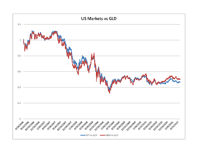
The above graphs, especially the last two, surprised me: notice that the US equity markets start a precipitous decline in mid-2007, have a V-shaped dip reaching its nadir in early 2009, but do not ever recover beyond October 2010 level (to the present day). This is less true when the comparison is made with the Euro, but this just goes to show you that the Euro is almost as weak a currency as the USD. The conclusion seems inescapable: the recovery (at least of the equity market) is completely fake, and is caused entirely by Bernanke's helicopters circling overhead.

The last part of our analysis can be entitled:

What Gold Bubble?


Let us see how investing in the US markets would have done compared to your retro gold-hoarding neighbor:


The short (and unsurprising) answer is: terribly. Just as in the ancient joke, the way to make a kilo of gold in the stock market is to start out with two kilos. What, however, is much more (to me) surprising is that the collapse (in gold terms) started in 2007, and ever since (again) October 2010 the US equity market has actually maintained parity against gold, although the same cannot be said about the US dollar. Our final chart drives the point home. The chart shows the performance of gold when measured in the four currencies of this study (US dollar, Euro, the Swiss Frank, and the Australian dollar):

If you look at the chart carefully, you will see that gold peaked against the "hard" currencies in late 2008, and since then has been quite flat in both Swiss Franc and Australian Dollar terms (REALLY flat for the last year or so). So, there is no gold bubble currently (there might have been one leading up to 2008, but it was not really a bubble, since it had never popped. At worst, there was a mini-bubble in late 2008, which deflated and than reflated). What there appears to be is an ongoing collapse of the dollar, with no sign of abating.

What to do?


Other than getting very depressed...  The good news is that with the exception of the Australian Dollar, the other instruments described in this post are almost uncorrelated to the US equities. While I would not touch the Euro with a barge pole (I believe that it is fundamentally as weak as the US dollar),  and since the AUD has much better fundamentals than the swiss franc and gold, I see no downside in holding some mix of the the three (FXA, FXF, GLD, or the underliers) to at least diversify away some of the US equity (or currency) risk.

Friday, May 20, 2011

The Russell 2000, the CAPM, and why is it so hard to stay market neutral

Samsara (the fund I run) uses primarily Russell 2000 futures to hedge. Through most of the history of the fund we have been net market long, but in the middle of 2010 I made a fateful decision to try to be close to market neutral. After a while of experiencing something unpleasantly like spitting in the wind, I started wondering whether I was using the right hedging instrument. Indeed, consider the following graph of recent performance of IWM (the Russell 2000 ETF) versus that of SPY (the S&P 500 ETF) [I use the ETF instead of the underlying index because the ETFs take account of the dividends paid by the index constitutents -- the expense ratio of the two ETFs is close to the same, so does not affect the comparison):

You will see that while both indices did well, the IWM outperformed the SPY by some seven percent over the (roughly) six months.


Since both indices were up (a lot), a natural hypothesis is that CAPM (the capital assets pricing model) should explain the difference: The Russell is viewed as riskier, so has a beta greater than one versus the more staid S&P 500. To test this, I did the following experiment: I compared IWM and SPY from the inception of IWM (5/30/2000), and ran a regression of IWM vs SPY log returns going back sixty trading days (so roughly a calendar quarter). 

Here is what we get: First, we see that the beta is highly variable, as seen in the table below:


As is the alpha:


But it also is clear that alpha is bouncing around close to zero (the huge spikes up and down in the fall of 2008 should not surprise those of us who lived through the period). In fact, the average alpha is the not-so-high 0.4 basis points per day (which means that if you kept rebalancing your portfolio of long IWM and short SPY to keep it 60-day-beta-neutral, you would make a princely 1% a year, not accounting for transaction costs (which would certainly eat up all of your profit).

So, a victory for the CAPM! Or is it? Look at the graph of betas again. You will see that in times of bull markets beta increases, while in times of crisis we see the much-discussed "phase-locking" behavior: betas converge back to 1. Indeed, if you were to hold a dollar neutral portfolio (long IWM, short SPY) for the eleven years of this study, you would have made 80 cents on your long dollar, with a Sharpe ratio of around 0.5, and max drawdown of around 20% (by contrast, simply being long IWM would have made you a little more money ($1.10) with a lot more volatility: the Sharpe Ratio would be close to 0.24, and the drawdown a stomach churning 60%. A picture is worth a thousand words:


The green curve is the return of SPY, which seems to have all of the downsides (huge drawdown) and none of the upside of the other two methods. Over the study period, the IWM runs a beta of fairly close to 1 vs SPY (1.09) , and alpha of around 2bp per day, or around 5% a year. (we could have gotten better Sharpe ratio by using the historical 1.09 beta to hedge our IWM holdings, but that could be viewed as cheating, while the beta of 1 is the reasonable bayesian prior.

What is the moral of the story? It seems that CAPM works in the short term, and if you want to hedge your long positions, Russell index futures are somewhat more cost effective than S&P 500 index futures (lower margin requirements). However, in the long term, it seems that small cap stocks outperform strongly in bull markets, and do not underperform much in bear markets, and so are a much better long-term investment.

Of course, your mileage can (and usually does) vary.

Monday, May 9, 2011

What use is the VIX?

Once upon a time (or, around six months ago) I decided that the volatility of US equities markets could not help but increase, and, in addition to the usual hedges I should hedge against that eventuality as well. Luckily, there was a publicly traded instrument to do just that: the VXX. Happy to have bought insurance against yet another dragon lurking in the shadows, I sat back and observed the following (the chart ends two months ago, since this shows two-month trailing volatility; I bought VXX about two months into the chart, at day 45 or so):


So, I should have been pleased with my investment. But imagine my dismay when this is what I saw in my portfolio:


The two graphs look quite different, and some statistical analysis was in order. First, let us compare the graphs of trailing volatility and the VXX, and see what we see:

There does appear to be some relationship. Now, let's start our study closer to the end of 2009. We see the following:

The relationship seems to become more tenuous. Why? Well, we recall that the first three and a half months of 2009 were very dark months indeed for the market: at that time volatility was very high (since no one was in the market, except yours truly), and returns were abysmal. In fact, this thought is borne out completely:

It turns out that outside of full catastrophe mode, the correlation between VXX and trailing volatility is quite poor (17%), and between the VXX and volatility in two months to come (for all you believers in the wisdom of Mr Market) is even poorer (around 5%). What the change in the VXX is really well correlated with is, however, is the market returns. The correlation between the change in VXX and the change in S&P 500 is a whopping -70% -- below is a scatter plot to drive the point home:

What does this all mean, given that the VXX is suppsedly backed out of implied volatility of stock options? Presumably, that in good times the market grossly underestimates its own volatility? You be the judge...