Friday, September 9, 2011
A non-arbed-out trading idea
It is an empirical (but not fully backtested) observation that every time our fearless leader speaks the market tanks. Some have doubted this on the grounds that correlation does not mean causality, but the first (and quite considerable) example of this phenomenon happened on the occasion of his inauguration, where, as the great man spoke the S&P 500 plunged by around 5% (from 840 to 805), this setting the tone for the rest of his term (I almost said "hopefully his only term", but the alternatives look pretty bleak also).
Marc Faber: Gold is Dirt cheap.
| ||||||||||||||||||||||||||||||

Wednesday, August 17, 2011
Very well put
I
David Stockman: Rick Perry Is Right, the Fed Is “Totally Wrong†| Daily Ticker - Yahoo! Finance
http://finance.yahoo.com/blogs/daily-ticker/david-stockman-rick-perry-fed-totally-wrong-151724790.html
============================================================
Yahoo! Finance http://finance.yahoo.com/
David Stockman: Rick Perry Is Right, the Fed Is “Totally Wrong†| Daily Ticker - Yahoo! Finance
http://finance.yahoo.com/blogs/daily-ticker/david-stockman-rick-perry-fed-totally-wrong-151724790.html
============================================================
Yahoo! Finance http://finance.yahoo.com/
Wednesday, June 8, 2011
The continuing mystery of gold
Actually, as previous posts seem to indicate, there is no great mystery to gold: the executive summary is that it is not so much that gold is going up as that the dollar is going down. What is, however, mysterious, is that the gold miners are not doing very well. Indeed, this year, gold prices (as measured by GLD) have gone up some 8%, which is (as of today, June 8 2011) considerably better than any of the stock indices. Gold miners, however, are performing truly abysmally: the chart below shows the performance of gold vs S&P 500, vs NEM -- Newmont Mining (NEM), which is down almost twenty percent year to date. A picture is worth a thousand words:

Newmont's friends and competitors which constitute the GDX ETF are doing abut the same. Now, if gold prices were very high compared to the cost of extraction, then gold miners should be doing very well. If, s previously suggested, we have no gold bubble, then the cost of extracting gold out of the ground should be growing roughly as the price of the metal itself, and if the margins were roughly constant in percentage terms, the prices of mining stocks should be growing roughly as fast as the price of gold. It has been suggested that the wear and tear on the mines is adversely affecting the price of gold miners. Let's test this theory, and look at the Price/Earnings ratio of long-suffering NEM versus that of the S&P.

The sharp-eyed reader will see that until the end of 2009, gold miners were the toast of the town, but since the beginning of 2010, they suddenly became the black sheep of the investment community, and the current P/E of Newmont (around 11) is only slightly higher than that of the S&P 500 at the nadir of the stock market collapse (3/9/2009, when it was a little over 10). Indeed, while NEM's share price (adjusted for dividends) has risen by 25% over the last five years, its P/E ratio has gone from around 70(!) to the current 11.
The only at all plausible explanation for this strangeness I have seen is that some hedge funds use gold mining stocks to hedge their gold positions. Well, actually, this does not really make sense to me -- the obvious trade at this point is go long miners (perhaps hedging with GLD), but nothing else does either, since it seems that GDX and friends appear undervalued by some 30% (and there have been massive selling in the last couple of days).
NOTE: Samsara is long gold mining stocks, and has been for quite a while (somewhat to its chagrin).
Saturday, June 4, 2011
Trading strategies
I had fallen victim of Amazon's one-click Kindle purchasing one time too many, and, without thinking, bought this book, which, to my dismay, is another piece of chartist claptrap backing up its techniques with claims of years of impressive results -- I discovered this on a plane flight, and quickly diverted myself with a nap, but this experience turned my thoughts to that best of gambling (which is really the same as trading) systems: the martingale. To refresh the reader's memory, this system (already popular in 18th century France) allows one to win against any casino game, no matter how big the house edge. As an example, we will use Roulette, in its primitive red-black form: the gambler comes into the casino, and bets a dollar on red. If he wins, he walks away. If he loses, he bets two dollars. If he now wins, he has won two dollars after losing one, so walks away with a dollar net gain. If he loses, he now bets four dollars. It is easy to see that this sequence of double-downs allows our gambler to walk away with a dollar, with probability one. Somewhat unfortunately, this system works particularly well if you have unlimited bankroll, in which case winning a dollar might be viewed as rather small pickings.
The first (and most important) improvement to this strategy is to start a hedge fund. Let's assume, for the sake of argument, that the starting capital is $1000. Our intrepid money manager (based in Atlantic City, for convenience -- lets call him A) walks into Taj Mahal every trading day, and practices the martingale. Since his Sharpe ratio is infinite (every day he makes his dollar, like clockwork), his investors are happy. In the 250 trading days of the year, he makes \$250, which is a 25\% return, of which he collects a 20\% performance allocation of \$50. In addition, he makes \$20 in management fees, so in a little under four years our hero is around \$250 richer. A good thing, too, since this is roughly when A loses \$1000, to the chagrin of his investors.
The next, and also important step, in this process is leverage: Money manager B, having observed A, is horrified that the investors had lost money, while A has made out rather well. So, B borrows money on margin, so he now has \$2000 to play with, so he scales up his bets two times higher than A. At the end of four years, not only does he have \$500, but when the day of reckoning comes, a large chunk of the damage he suffers is allocated to the lender, so both B and B's investors are happy. Not so the bank's shareholders.
As a final(?) improvement, our manager C has not \$2000, but \$20000000000. All of the activity in the previous paragraph takes place, but now the bank's shareholders (and especially its bondholders) proclaim the bank too big to fail, and the bill goes to the taxpayers, of whom there are quite a few, and it takes only a few dollars of the savings of each of them to subsidize C, his investors, the bankers, and the vitally important luxury yacht industry, it seems that everyone is now happy.
Progress is a wonderful thing!
What is interesting is that the parable described above not only describes much of recent "investment" activity, but also encapsulates pretty much the entire content of The Black Swan, at greatly reduced investment of time, money, and pseudo-intellectual rambling.
Thursday, June 2, 2011
More on inflation
This is a continuation of the last post. After looking at it, it seemed to me that the interpretation of the chart was a little oversimplified, and that was because the numbers had changed so much over the 18 years of the study that log scale would be more enlightening. No easier said than done (OK, a little easier said). Here is the same graph in log scale:
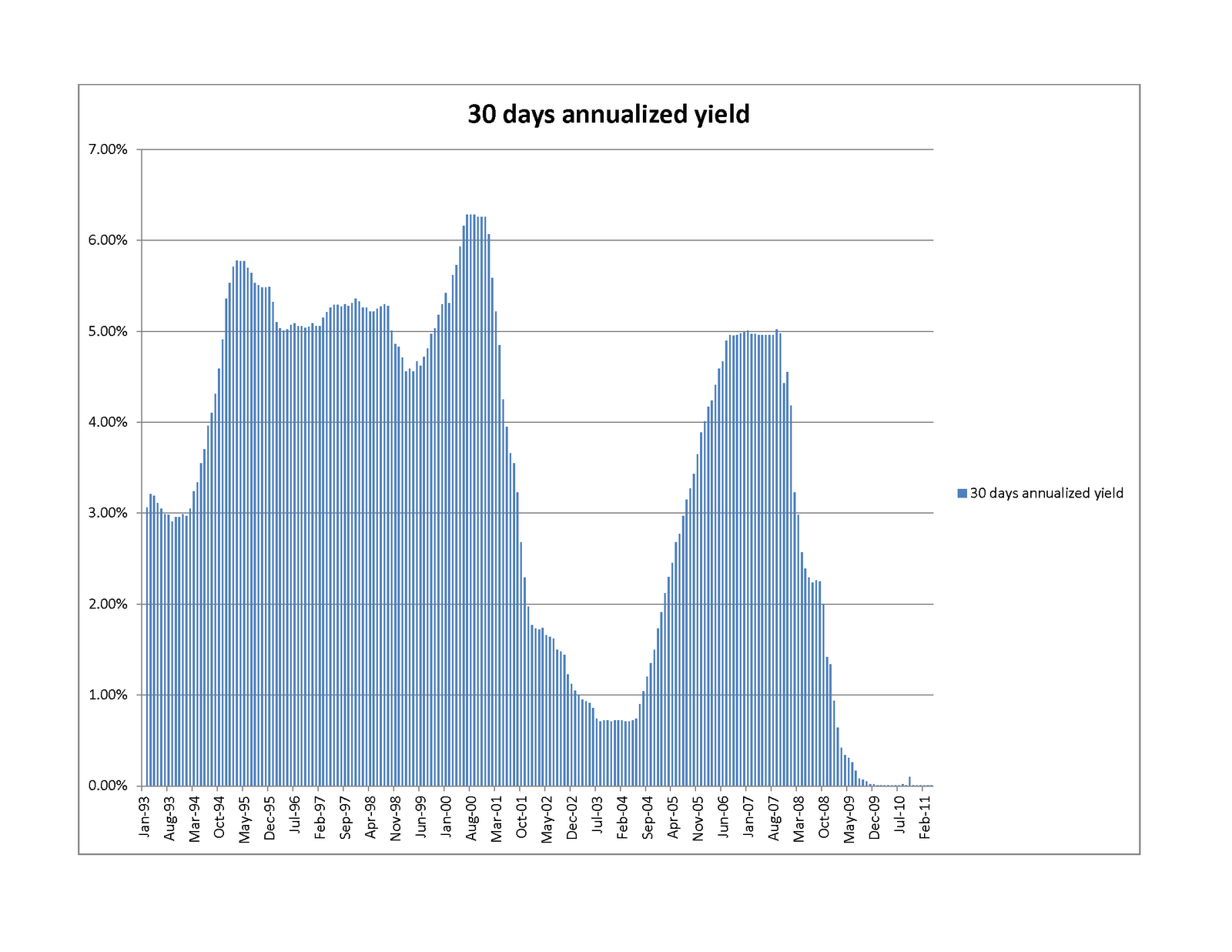
 In this form, it seems clear that (other than some cyclical behavior) there was essentially no commodity price inflation from the beginning of the study (January 1993) until the end of 2001 -- beginning of 2002 (also known as the Dot Com crash). In those nine years, a conservative saver seems to have actually increased the purchasing power of his bank account quite considerably (by around 50%, in real terms). During that golden age (which we can call the Age of Clinton), there was a combination of the peace dividend, considerable technological innovation, a gridlocked government which actually managed to run a surplus, and fairly conservative fiscal policy. The chart below shows prevailing money market rates, which are closely tied to Fed Funds:
 You will note that the "Greenspan put" coincides almost exactly with the end of the golden age (marked somewhat more memorably by the terrorist attacks of 9/11/2001). The massive money printing, did not wait to make itself be felt: tgold prices rise at a 1.5% a month clip -- the log scale graphs are amazingly linear (the F statistic, which shows the strength of the trend, is around 5000), commodity basket prices rise somewhat slower (1.1% a month clip), with more variability. During this period (the last ten years, approximately), our hapless saver's money market account gains around 20% in nominal dollars, but loses around 70% of its commodities purchasing power. Being no fool, our saver decided to invest her hard-earned dollars in real estate, but imagine her dismay when that investment did about as well (or poorly) as her neighbor's money market account (the graph below shows the change in the Case-Shiller index versus the Money Market account. You will see that nominally, Case-Shiller outperformed the money market account by around 15%, but all of that and more was eaten up by transaction costs, property taxes, and so on. I am only viewing housing as an investment, so am not counting the savings of rent or the mortgage tax deduction.

Since the move into housing was borne of desperation with the performance of the simpler ways of saving, it is not at all surprising that the returns are similar, though as we all know, the disruption caused by the fact that real estate investment is very far from risk free (as everyone now knows) has been rather considerable.
It is always harder to determine causality than correlation, so the graphs by no means prove that that monetary policy caused the end of the Golden Age of Clinton and the implosion of our savings, but they do provide some food for thought, I hope.
Wednesday, June 1, 2011
What is inflation really, or what's the use of gold?
Those who have read this previous post probably (and understandably) wonder how reasonable the Alternative CPI measure is. After all, it seems to indicate that our cost of living has increased almost four-fold since 1993, which seems rather steep (mostly since for only very few of us has our income increased four-fold in the same period). There is no question that the official numbers are seriously gamed (see this note, or this), but that, in and of itself mean that the alternative numbers are right. My personal view is that the Alternative CPI measure is more a measure of inflation (that is, the debasement of the dollar) than the actual CPI growth -- the latter tends to be smaller than the former, since the money-printing is offset by technological progress, which causes computers to drop from $6000 in 1981 to $150 at Walmart in 2011 (the latter computer also being several orders more powerful), and your car's fuel consumption to go from 8mpg in the 1960s to 40mpg today.
A good proxy for inflation is, however, provided by prices of commodities (still not perfect, since exploration and mining also have made considerable strides), and since a representative basket of commodities is rather cumbersome to hold, a good proxy for one is gold -- indeed, gold is almost miraculously convenient -- it is compact, it does not degrade, and it saves you from buying shares of oil tankers parked off Singapore.
The above seems counterintuitive (after all, we have all heard of the gold bubble, but [relatively] few of us have heard of the the wool, rice, natural gas, or any one of the many other possible commodities bubbles. Well, luckily for us, the IMF maintains a commodities price index, so we can compare and contrast. Here is the requisite chart:

Some explanation might be in orer: The very smooth red line shows how many dollars you would have were you to invest $1 in a money market account in January of 1993. The almost-as-smooth green line shows how many of those dollars you would need according to the Alternative CPI computation to purchase a basket of goods worth $1 in Jan 1993. The jagged purple line shows how many of those dollars you would need to purchase however much gold you could buy for a dollar in January of 1993, while the really jagged light blue line shows the same for a dollars worth of a commodity basket. The conclusions, at least to me, are:
- The Alternative CPI seems, as advertised, to be a good measure of inflation (and is, therefore, a bit of an overestimate of the actual price inflation).
- There is no gold bubble (a conclusion also drawn in a previous post from other data).
- Gold (in addition to its compactness) is a better gauge of monetary inflation than the commodities basket (witness the huge volatility in the latter starting in late 2007 or, for that matter, just in this May.
- The red line (your risk free return) was added just to make the chart more depressing. Unfortunately, it has achieved its goal brilliantly.
Wednesday, May 25, 2011
Your dollars at work, continued
To add some color to the previous post, we can compare how the returns of our instruments of choice, to wit:


- FXA (corresponding to Australian Dollar money market fund).
- FXE (corresponding to a Euro money market fund)
- FXF (corresponding to a Swiss Franc money market fund)
- GLD (corresponding to physical gold)
- SPY (corresponding to the S&P 500 with dividends reinvested)
- IWM (corresponding to the Russell 2000 with dividends reinvested)

You will note that over the last five years, the S&P 500 barely holds its own even in using the BLS numbers, while the Russell 2000 beats them only modestly. If you use the "Alternative" deflator, you will find that the US equities markets perform rather pathetically, gold has performaed quite well,which could mean one of at least three things:
- Gold is overvalued
- Inflation is expected to pick up even more
- Our time series does not go back far enough, and gold had been somewhat undervalued before 2006
The next chart summarizes what I had just said above, by expressing returns in alternative constant dollars (where the thicker lines are the S&P 500 and the Russell 2000):

Finally, everyone wants to know how the other (antipodal) half lives, and now we express our cost of living and returns of financial instruments in terms of the Australian Dollar:

The thick light blue line is the (alternative) CPI. Apparently, an Australian saw the price of gold peak back in late 2008, and it has been fairly constant later. The Australian who travels to the US frequently has apparently found that it has not gotten more costly over the last five years, and, if he is wise, he would not have invested in the US equities markets (which would have lost him 20% of his money). More interestingly, neither would he have invested in the Australian Equities market (dark blue thick line -- the MSCI Australia index, with dividends reinvested, as represented by the EWA ETF), which, while outperforming the US markets, did worse than keeping the Ozzies in a money market fund. Strange, but, seemingly, true.
Monday, May 23, 2011
Your dollars at work, or the new Argentina.
This post was inspired by recently reading Jeff Augen's (in many ways disappointing) book Trading Realities". Augen comments that the moves in the US stock markets can be largely explained by currency fluctuations. I decided to investigate the relationship, and rounded up the following ETFs (all of which are preferable to "raw" instruments, since they keep track of dividends and such, and all have a rather low expense ratio:
- SPY -- a proxy for the S&P 500 (with dividends reinvested.)
- IWM -- a proxy for the Russell 2000 (with dividends reinveste)
- GLD -- a proxy for physical gold (notorious for not paying dividends)
- FXA -- a proxy for the Australian Dollar (pays interest, roughly equal to the Australian Central Bank overnight rate).
- FXE -- a proxy for the Euro (pays interest, just as, though not as much as, the Ozzie)
- FXF -- a proxy for the Swiss Franc (pays interest, as above).

But more shocks were to come. The charts below show how well a European, a Swiss, or an Australian would do investing in the US stock market, compared to a compatriot who decided to keep her money in a mattress:


The last part of our analysis can be entitled:
What Gold Bubble?
Let us see how investing in the US markets would have done compared to your retro gold-hoarding neighbor:

The short (and unsurprising) answer is: terribly. Just as in the ancient joke, the way to make a kilo of gold in the stock market is to start out with two kilos. What, however, is much more (to me) surprising is that the collapse (in gold terms) started in 2007, and ever since (again) October 2010 the US equity market has actually maintained parity against gold, although the same cannot be said about the US dollar. Our final chart drives the point home. The chart shows the performance of gold when measured in the four currencies of this study (US dollar, Euro, the Swiss Frank, and the Australian dollar):

What to do?
Other than getting very depressed... The good news is that with the exception of the Australian Dollar, the other instruments described in this post are almost uncorrelated to the US equities. While I would not touch the Euro with a barge pole (I believe that it is fundamentally as weak as the US dollar), and since the AUD has much better fundamentals than the swiss franc and gold, I see no downside in holding some mix of the the three (FXA, FXF, GLD, or the underliers) to at least diversify away some of the US equity (or currency) risk.
Friday, May 20, 2011
The Russell 2000, the CAPM, and why is it so hard to stay market neutral
Samsara (the fund I run) uses primarily Russell 2000 futures to hedge. Through most of the history of the fund we have been net market long, but in the middle of 2010 I made a fateful decision to try to be close to market neutral. After a while of experiencing something unpleasantly like spitting in the wind, I started wondering whether I was using the right hedging instrument. Indeed, consider the following graph of recent performance of IWM (the Russell 2000 ETF) versus that of SPY (the S&P 500 ETF) [I use the ETF instead of the underlying index because the ETFs take account of the dividends paid by the index constitutents -- the expense ratio of the two ETFs is close to the same, so does not affect the comparison):
You will see that while both indices did well, the IWM outperformed the SPY by some seven percent over the (roughly) six months.


You will see that while both indices did well, the IWM outperformed the SPY by some seven percent over the (roughly) six months.

Since both indices were up (a lot), a natural hypothesis is that CAPM (the capital assets pricing model) should explain the difference: The Russell is viewed as riskier, so has a beta greater than one versus the more staid S&P 500. To test this, I did the following experiment: I compared IWM and SPY from the inception of IWM (5/30/2000), and ran a regression of IWM vs SPY log returns going back sixty trading days (so roughly a calendar quarter).
Here is what we get: First, we see that the beta is highly variable, as seen in the table below:

As is the alpha:

But it also is clear that alpha is bouncing around close to zero (the huge spikes up and down in the fall of 2008 should not surprise those of us who lived through the period). In fact, the average alpha is the not-so-high 0.4 basis points per day (which means that if you kept rebalancing your portfolio of long IWM and short SPY to keep it 60-day-beta-neutral, you would make a princely 1% a year, not accounting for transaction costs (which would certainly eat up all of your profit).
So, a victory for the CAPM! Or is it? Look at the graph of betas again. You will see that in times of bull markets beta increases, while in times of crisis we see the much-discussed "phase-locking" behavior: betas converge back to 1. Indeed, if you were to hold a dollar neutral portfolio (long IWM, short SPY) for the eleven years of this study, you would have made 80 cents on your long dollar, with a Sharpe ratio of around 0.5, and max drawdown of around 20% (by contrast, simply being long IWM would have made you a little more money ($1.10) with a lot more volatility: the Sharpe Ratio would be close to 0.24, and the drawdown a stomach churning 60%. A picture is worth a thousand words:

The green curve is the return of SPY, which seems to have all of the downsides (huge drawdown) and none of the upside of the other two methods. Over the study period, the IWM runs a beta of fairly close to 1 vs SPY (1.09) , and alpha of around 2bp per day, or around 5% a year. (we could have gotten better Sharpe ratio by using the historical 1.09 beta to hedge our IWM holdings, but that could be viewed as cheating, while the beta of 1 is the reasonable bayesian prior.
What is the moral of the story? It seems that CAPM works in the short term, and if you want to hedge your long positions, Russell index futures are somewhat more cost effective than S&P 500 index futures (lower margin requirements). However, in the long term, it seems that small cap stocks outperform strongly in bull markets, and do not underperform much in bear markets, and so are a much better long-term investment.
Of course, your mileage can (and usually does) vary.
Monday, May 9, 2011
What use is the VIX?
Once upon a time (or, around six months ago) I decided that the volatility of US equities markets could not help but increase, and, in addition to the usual hedges I should hedge against that eventuality as well. Luckily, there was a publicly traded instrument to do just that: the VXX. Happy to have bought insurance against yet another dragon lurking in the shadows, I sat back and observed the following (the chart ends two months ago, since this shows two-month trailing volatility; I bought VXX about two months into the chart, at day 45 or so):


So, I should have been pleased with my investment. But imagine my dismay when this is what I saw in my portfolio:

The two graphs look quite different, and some statistical analysis was in order. First, let us compare the graphs of trailing volatility and the VXX, and see what we see:

There does appear to be some relationship. Now, let's start our study closer to the end of 2009. We see the following:

The relationship seems to become more tenuous. Why? Well, we recall that the first three and a half months of 2009 were very dark months indeed for the market: at that time volatility was very high (since no one was in the market, except yours truly), and returns were abysmal. In fact, this thought is borne out completely:
It turns out that outside of full catastrophe mode, the correlation between VXX and trailing volatility is quite poor (17%), and between the VXX and volatility in two months to come (for all you believers in the wisdom of Mr Market) is even poorer (around 5%). What the change in the VXX is really well correlated with is, however, is the market returns. The correlation between the change in VXX and the change in S&P 500 is a whopping -70% -- below is a scatter plot to drive the point home:

What does this all mean, given that the VXX is suppsedly backed out of implied volatility of stock options? Presumably, that in good times the market grossly underestimates its own volatility? You be the judge...
Subscribe to:
Posts (Atom)